Introduction
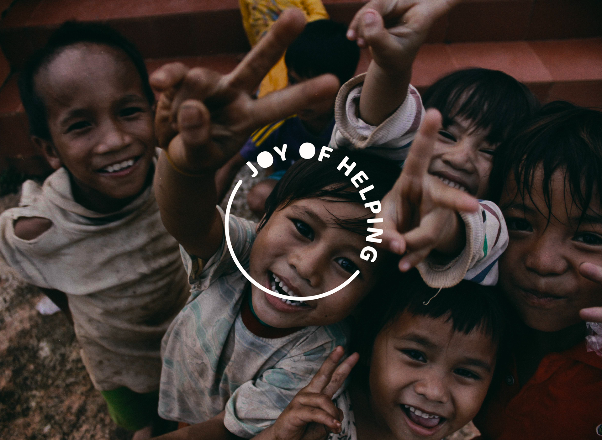
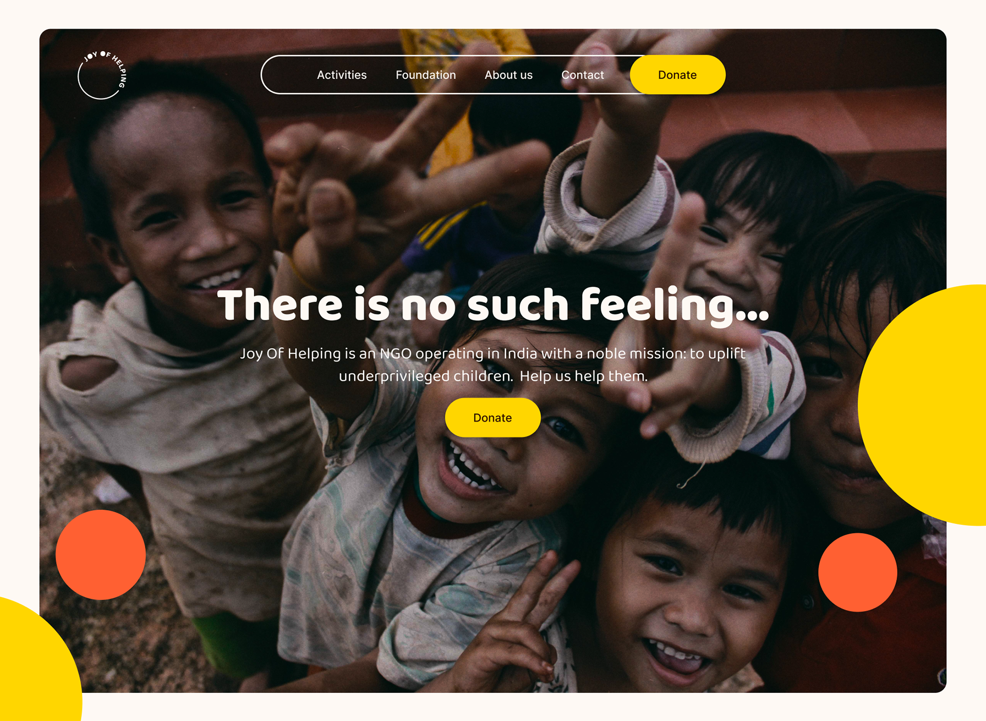
Joy Of Helping is an NGO operating in India with a noble mission: to uplift underprivileged children. In a challenging environment where engaging the working-class population in charitable activities is no small feat, our task was to craft a brand identity that radiated the essence of joy in giving.
Brand Identity
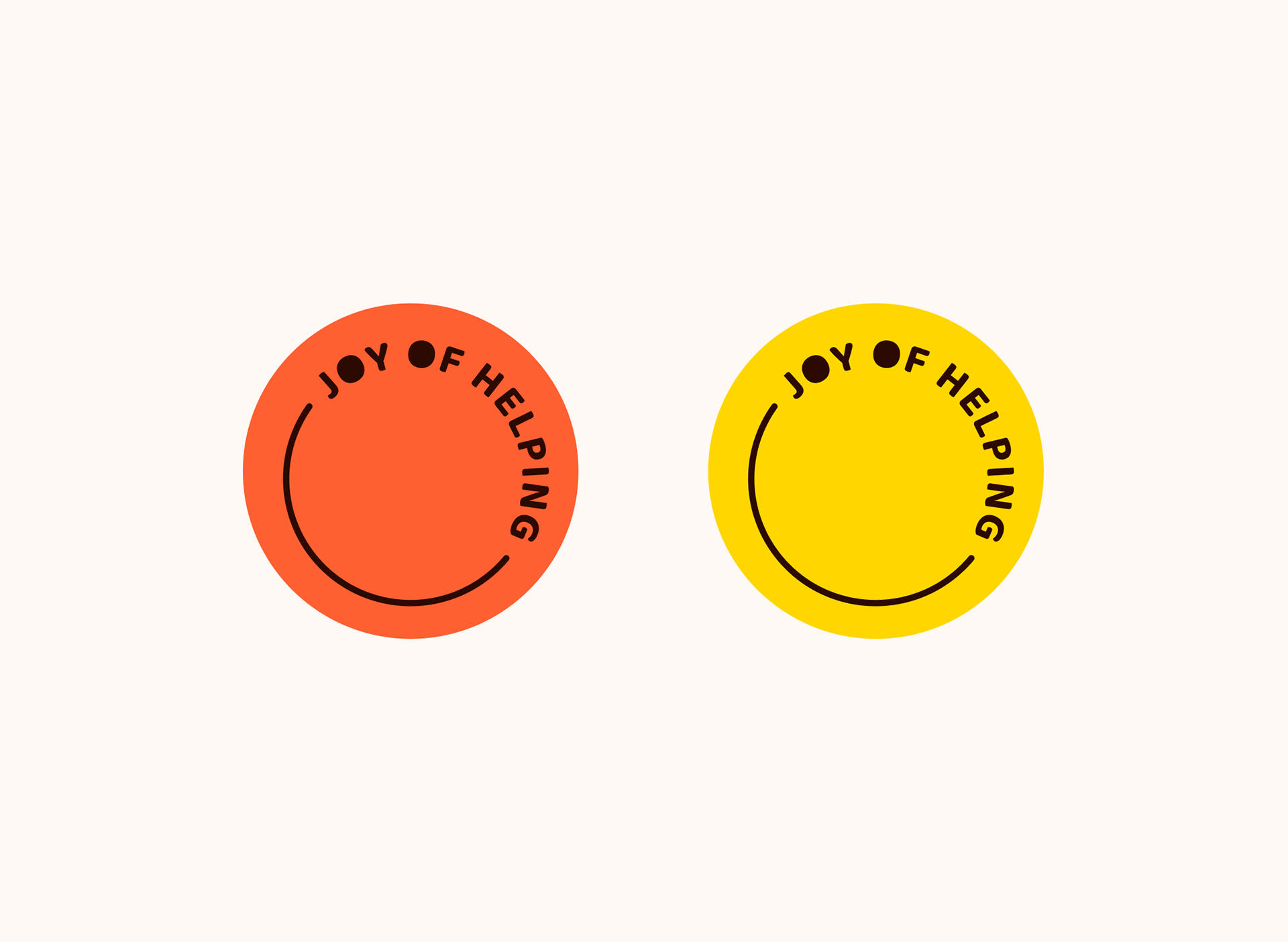
Our creative journey led us to a delightful solution: a minimalist logotype featuring a smiling face. What made this design truly special was the serendipitous discovery that the letter "O" in "Joy Of Helping" could be ingeniously transformed into the eyes of the smiley. The resulting logo exudes warmth, happiness, and a welcoming spirit, making it adaptable for a myriad of applications.
Brand Colors
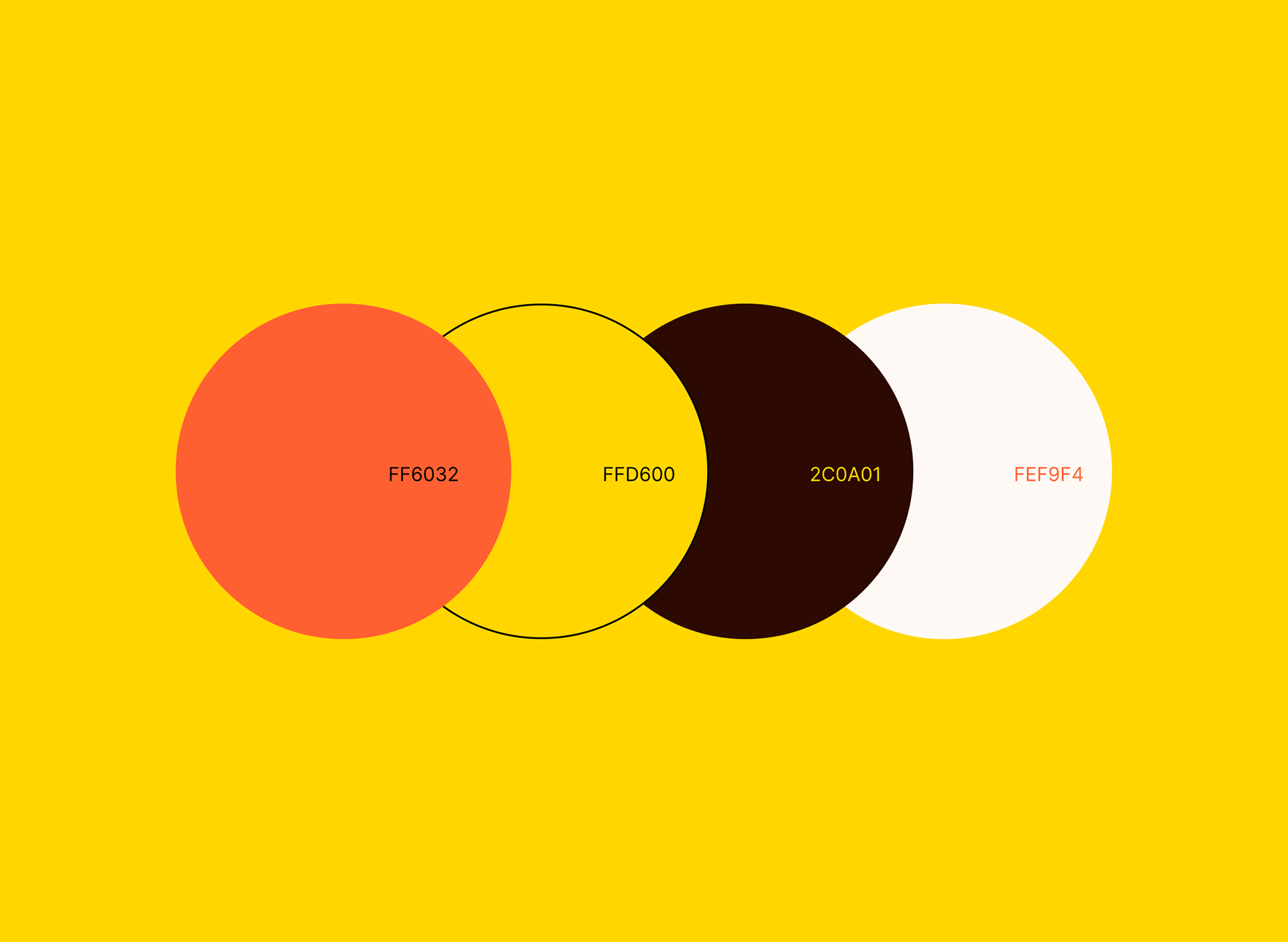
To infuse the brand with a sense of warmth and joy, we chose a color palette rooted in the warmer end of the spectrum. Primary hues of yellow and orange were selected for their ability to evoke a feeling of cheerfulness and goodwill. These colors provide a harmonious backdrop for our brand identity.
Brand Typography
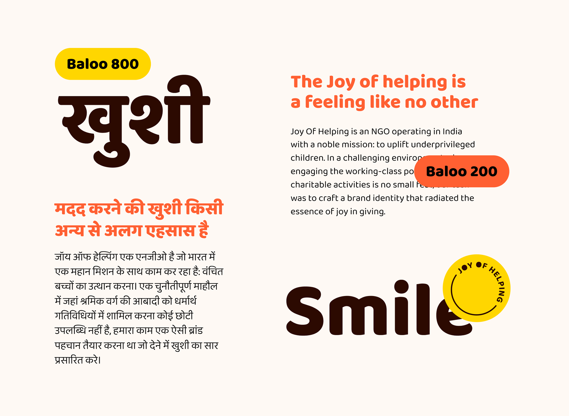
Selecting the right typeface was pivotal in ensuring our brand was accessible and legible across various platforms and languages. We opted for Baloo by Ek Type, a renowned type design studio based in Mumbai. Baloo is a versatile typeface with excellent support for multiple languages, making it perfect for both large-format prints and mobile screens. Its readability and adaptability were key considerations in our choice.
The result of our creative efforts is a brand identity that embodies the very spirit of Joy Of Helping. With its joyful logo, warm color palette, and versatile typography, the branding positions the NGO as a beacon of happiness, bringing smiles to the faces of children while inviting others to discover the joy of helping.